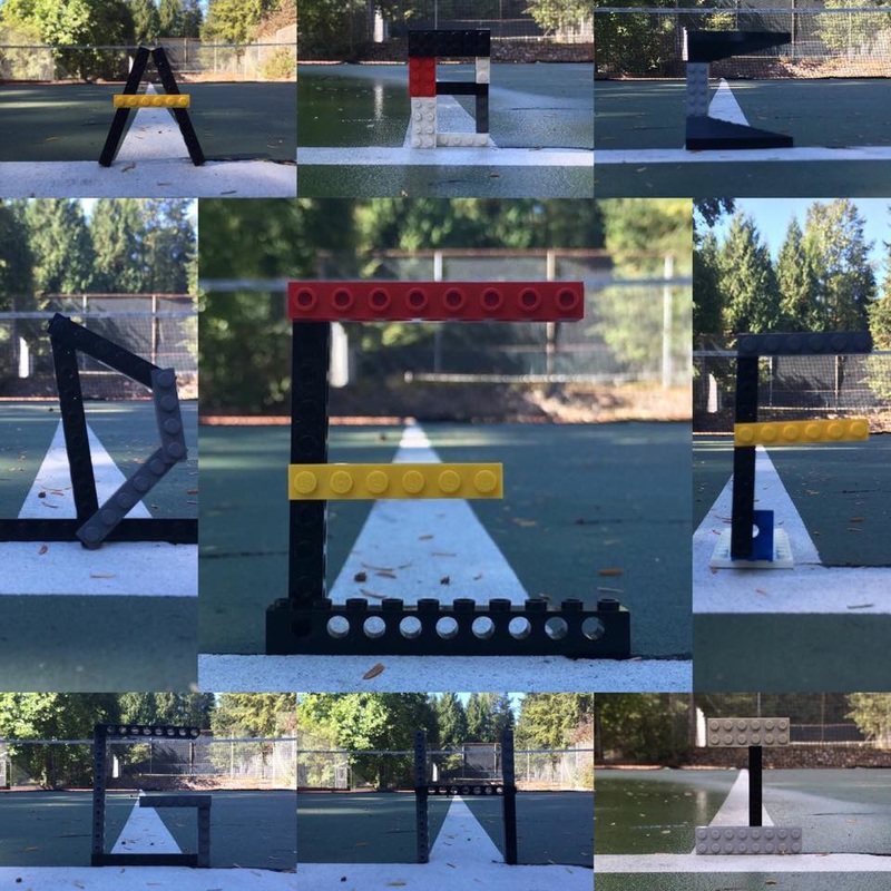
This project was lots of fun for me. I liked how we got to go outside and do our own thing. One challenge we had was making round letters because we had straight lego. Also, we decided to make our letters stand up so finding a way to have them balance was a challenge. Overall, I am happy with the way it turned out.
This was the first font I tried to re create. I found making the general shape of the letter easy but the details were a bit harder. My line on the bottom of the spur is on more of an angle than the original, as well my dot is smaller. This is a fun font that you would not use if you were writing a serious article, but more for if you were writing a funny story. This one was a lot more frustrating than the last one. It has a lot more detail and many more ways to mess it up. On my original drawing (left photo) I liked the detailed in the lines but I realized after I made it way too wide. I uploaded the photo to a photoshop app on my phone and I made it look a lot closer to the original one. I drew this one free hand so the lines are not perfect, but this is kind of a crazy font so I don't find it matters too much that it's not perfect. ![]() This was the first whole word I wrote. I did it free hand as well so it is not perfectly straight. I wanted to make a colourful one since my last two were black. I picked what colours I used based on the word "Couture." I thought of fashion, pretty girls, and pink. It is bold in the original font photo so in order to make mine appear bold too I outlined it in a different colour than the inside. I thought it looked boring when I finished the word so I added the under line. It is supposed to look like vanity lights that you would see in dressing rooms of high end fashion shows. |
Archives
February 2016
Categories |